- O2 Community
- Discussions, Feedback & off-topic
- Discussions & Feedback
- "Contact Me" - user interface typeface/formatting ...
- Subscribe to RSS Feed
- Mark Topic as New
- Mark Topic as Read
- Float this Topic for Current User
- Bookmark
- Subscribe
- Mute
- Printer Friendly Page
"Contact Me" - user interface typeface/formatting conundrum
- Mark as New
- Bookmark
- Subscribe
- Mute
- Subscribe to RSS Feed
- Permalink
- Report Content
on 19-12-2018 14:21
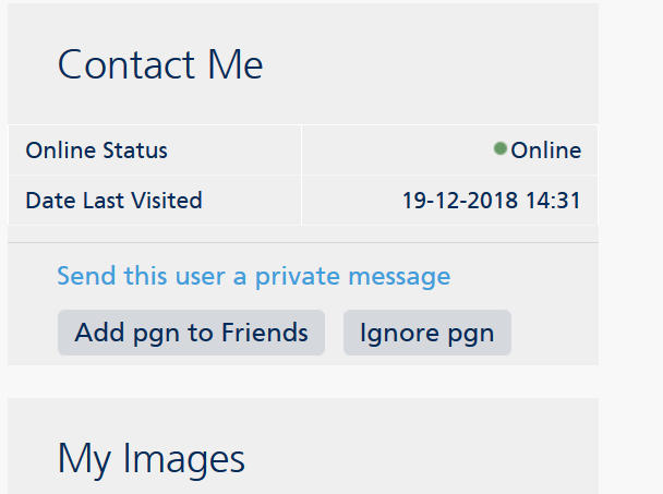
So why, when you click on a user's name, does the "Contact Me" box use two different styles for clickable links, all of which are related to the user whose profile you're looking at?
Is there something different about
- Send this user a private message
vs
- Remove Username from Friends
- Ignore Username
that merits the first one simply being blue typeface vs the lower two being darker text on shaded grey buttons?
And why "this user" in the upper prompt, and "Username" in the lower two...?
It's awfy confusin'....![]()
on 19-12-2018 14:25
- Mark as New
- Bookmark
- Subscribe
- Mute
- Subscribe to RSS Feed
- Permalink
- Report Content
on 19-12-2018 14:25
And I'd love go know why a posted topic gets a 24 hour time stamp, but when it gets posted on... reverts to 12 hour clock!
- 41235 Posts
- 247 Topics
- 1844 Solutions
on 19-12-2018 14:31
- Mark as New
- Bookmark
- Subscribe
- Mute
- Subscribe to RSS Feed
- Permalink
- Report Content
on 19-12-2018 14:31
@Anonymous wrote:And I'd love go know why a posted topic gets a 24 hour time stamp, but when it gets posted on... reverts to 12 hour clock!
This bit here, y'mean?
I haven't noticed the 12-hour one...
- Mark as New
- Bookmark
- Subscribe
- Mute
- Subscribe to RSS Feed
- Permalink
- Report Content
on 19-12-2018 14:32
Well when I click on your name using my phone it gives me the option to send you a PM or unfollow. Nothing else, just to confuse you more 😂


- 130049 Posts
- 838 Topics
- 7607 Solutions
on 19-12-2018 14:37
- Mark as New
- Bookmark
- Subscribe
- Mute
- Subscribe to RSS Feed
- Permalink
- Report Content
on 19-12-2018 14:37
This is what I get using my laptop
Veritas Numquam Perit

- 10294 Posts
- 85 Topics
- 123 Solutions
19-12-2018 14:52 - edited 19-12-2018 14:54
- Mark as New
- Bookmark
- Subscribe
- Mute
- Subscribe to RSS Feed
- Permalink
- Report Content
19-12-2018 14:52 - edited 19-12-2018 14:54
- 41235 Posts
- 247 Topics
- 1844 Solutions
19-12-2018 15:08 - edited 19-12-2018 15:09
- Mark as New
- Bookmark
- Subscribe
- Mute
- Subscribe to RSS Feed
- Permalink
- Report Content
19-12-2018 15:08 - edited 19-12-2018 15:09
@Glory1 wrote:Right I switched to full view and have the options to send this user a PM @pgn, add you to friends or ignore you.
Pretty much what @Cleoriff has.
Yip, that's about right, @Glory1 and @Cleoriff
But look at what it says: Why not "Send pgn a private message", inside a nice grey click-button like the other two?
Or "Ignore this user" or "Add this user to friends" in blue text, like the PM one?
Number of times I have had to rescan down and across the Contact Me page for the place to "send a PM" cos' it's not in a grey button like the other options... ![]()
- 96862 Posts
- 614 Topics
- 7196 Solutions
on 19-12-2018 15:12
- Mark as New
- Bookmark
- Subscribe
- Mute
- Subscribe to RSS Feed
- Permalink
- Report Content
on 19-12-2018 15:12
- 41235 Posts
- 247 Topics
- 1844 Solutions
on 19-12-2018 15:14
- Mark as New
- Bookmark
- Subscribe
- Mute
- Subscribe to RSS Feed
- Permalink
- Report Content
on 19-12-2018 15:14
- 10294 Posts
- 85 Topics
- 123 Solutions
on 19-12-2018 15:14
- Mark as New
- Bookmark
- Subscribe
- Mute
- Subscribe to RSS Feed
- Permalink
- Report Content
on 19-12-2018 15:14


